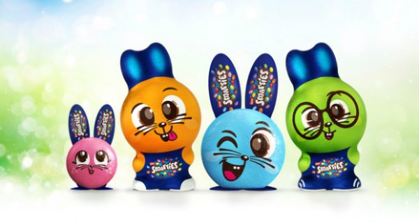
Steve Osborne from Osborne Pike and Will Davis of Studio Davis reveal the process behind, and approach to, the creation of characters for Smarties seasonal editions.
Since the publication of ‘How Brands Grow’ back in 2010, the way that brand owners view their packaging design has changed dramatically.
Far from using the pack as a training ground for Junior Brand Managers to cut their teeth on, it’s now far more common for the Marketing Director or even the CEO to take a keen interest in pack changes, because they finally know how the medium works.
That’s a mixed blessing for strategic design agencies like ours. On the one hand we’ve always advised brands to make even more of the things that make them recognizable, sometimes even famous. But by coining the term ‘Distinctive Assets’ and proposing a way to identity and measure them, Byron Sharp and his team have lent a lot of weight to that argument.
On the other hand there is sometimes a bit of a ‘knee-jerk’ reaction in the C-suite to the suggestion of a design change, even when one is patently needed. Indeed, How Brands Grow warns that ‘a design change is rarely a good idea’, but in our opinion this is only true when re-designs follow fashion, trends and competitors instead of the brand’s distinctive, ownable identity.
Lost in translation
This is not the topic of this article, but the role of Distinctive Assets is highly relevant in the world of brand extension and innovation. It’s often here that brands lose their way, adopting category codes or trying too hard to look cool and interesting. The result is often a fragmented pack that consumers don’t recognize and easily pass by.
In contrast, when a brand consciously designs its NPD from the assets outwards, even brand new products can instantly provide that all important mental shortcut to our memories of brands.
Distinctive packaging
Whilst a surprising variety of elements, from a jingle to a typeface, can count as Distinctive Assets, we find that logotype (a distinctive way of writing the brand name), unique colours, and packaging shape are the main triggers of instant recognition, at least on shelf.
In categories like confectionery, where the product itself can be designed in a unique form, there’s an extra source of potential distinctiveness. From Toblerone and Terry’s Chocolate Orange through to Kit Kat and Ferrero Rocher, it’s clear that many brands in this category trade on just such assets.
Seasonally generic
What the majority of brands have neglected, however, is their seasonal offerings. Instead of leveraging their core brand’s distinctive shape and other assets they have tended to offer generic chocolate shapes with a bolted-on logo.
Yet seasonal special editions are good business. Whilst some consumers are buying less confectionery on a day-to-day basis they still want to treat their family and friends at key seasonal occasions, and they are prepared to pay more (pence per gram for seasonal products is significantly higher than on standard lines).
The hollow figures market is worth £59m in the UK, divided between £27m for Christmas 2018 and £32m for Easter 2018. (Source: IRI).
Beyond the Smarties Tube
Having decided to shake up the category by creating something more distinctive and exciting, Nestlé partnered with the combined expertise of Osborne Pike, specialists in creating and managing Distinctive Brand Assets and Studio Davis, experts in 3D Brand Innovation.
In terms of design process, early design ideas were shared with Mums and Kids, resulting in a clear set of requirements for the figures: they had to be recognisably ‘made from’ Smarties in terms of shape and colour, and have the right personality, combining simplicity, playfulness and imagination.
The value of the research was turbocharged by the creation and rapid adaptation of 3D printed figures, allowing consumers to respond to the designs in a natural way, and without getting sticky fingers!
The insights confirmed the appeal of both character design and packaging made from the Distinctive Assets of Smarties: the specific ‘lentil’ form, the rainbow of colours, the shakeability and the brand promise – to stimulate imaginative play.
The final result is a whole family of strongly branded 3D figures and packaging. On shelf the ‘Smarticons’ take a bold step away from generic packaging shapes, and buyers have responded favourably.
Distinctiveness pays
The new packs have quickly become a 3D symbol of the brand, a novel way to (literally) play with Distinctive Assets. They’ve also been adapted to work at 4 different sizes and price points, from 18.5g impulse single figures to a full family gift set.
For the single impulse SKU, clever cardboard engineering allows the simple lentil shape to be turned into the seasonal character via the backing card – whether bunny ears and paws or penguin winter hats and webbed feet!
Following the successful launch of Smarties Penguins for Christmas 2019 (a 75% YOY increase* over last season’s generic figures), Smarties Bunnies are now appearing in-store ready for Easter.
Both ranges have been designed to share the same design language and manufacturing principles. This not only helps to increase the ‘mental availability’ of the Smarties brand throughout the year, but the use of common moulds also reduces complexity and cost in the manufacturing process – a win- win for any brand. (*IRI 8 w/e 26th October, Value Sales, Smarties Novelties vs YA)
Steve Osborne is managing director at Osborne Pike and Will Davis is founder of Studio Davis


